

Improved Layout and Positioning
Layout in CSS has traditionally been a bit of a pain, requiring hacks and loads of media queries to get it just so. New features make it increasingly possible to create adaptive, intuitive designs that respond to their environment without overcomplicating things.
Position Anchoring
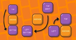 Imagine trying to create a tooltip that follows an element precisely, no matter where it moves on the screen. Previously, developers had to use JavaScript to dynamically calculate positions. With anchor positioning, elements can now be positioned relative to another element declaratively, making UI designs more adaptable and reducing reliance on JavaScript.
Auto Field-Sizi
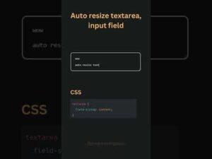
Ever wrestle with input fields cutting off user input or awkwardly stretching across the screen? Auto field-sizing dynamically resizes form fields to their content, enhancing usability and consistency in design, all without requiring complicated CSS hacks or JavaScript calculations.
Container Queries
Responsive design too often breaks when components rely purely on viewport-based media queries. Well, that was then. Container Queries now more powerful, enables components to react to the inline-size or block-size of their parent container. Rigid layouts are hence a thing of the past: your cards, widgets and sections will now resize based on their immediate surroundings, not the entire viewport.
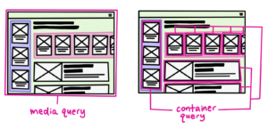
[Creative Commons] Credits: https://web.dev/blog/cq-stable
Subgrid
Working with grids usually comes with the extra baggage of additional nested elements that are not aligned as wanted. Subgrid solves this problem by allowing the child elements to inherit and align with their parent grid’s tracks, which means complex compositions will be neat, without extra div wrappers.

Enhancing Interactivity and Behavior
Often, interactivity on a website requires JavaScript, but modern CSS has been flipping that script lately. With the recent updates, though, that changed and opened interactive elements more accessibly without relying on additional scripting.
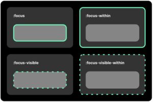
:focus-visible Pseudo-Class
Users often find focus outlines distracting when clicking elements with a mouse, yet essential for keyboard navigation. The :focus-visible pseudo-class improves this by ensuring focus styles only appear when needed, balancing accessibility with a clean user experience.
Credits: https://larsmagnus.co/blog/focus-visible-within-the-missing-pseudo-class
:has() Selector
Until recently, CSS had no parent selector. Rather than resort to JavaScript to test whether an element contains another, the :has() selector lets developers style parent elements based on what their children are—highlight a form field’s label only when the input is filled, for example.

Credits: https://www.youtube.com/watch?v=87C9RnH-mY0
Scroll Snap
Building image carousels or sectioned scrolling experiences usually requires pesky JavaScript. Scroll snap abstracts away from this and simply makes sure that elements snap in predictable ways so that scrolling behaves intuitively.

Credits: https://ishadeed.com/article/css-scroll-snap/
Advances in Color and Typography
Great design is more than layout: it’s about color and typographic readability. These new features in CSS continue to give the designer more mastery and creativity.
Now, with HDR displays, designers can use high-definition colors that provide even better contrast, vibrant visuals, and finer color grading options without being limited to a standard sRGB range.
Extended Color Functions
Mixing or adjusting colors in CSS traditionally required multiple steps. With new functions like color-mix(), color-contrast(), and color-adjust(), designers can dynamically adjust colors, hence improving accessibility and theme consistency.
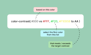
Credits: https://www.lambdatest.com/blog/css-color-contrast/
Relative Colors
Ever wanted to define a base color and then generate variations- such as darker, lighter, desaturated-without having to manually define each one? Well, relative colors will allow just that, which makes themes even more adaptive and easier to manage.
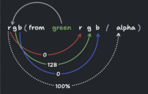
[Creatice Commons] Credits: https://developer.chrome.com/blog/css-relative-color-syntax
text-wrap: balance Property
No more awkward line breaks! The text-wrap: balance property will ensure multi-line text remains visually balanced, improving readability across devices without requiring manual adjustments.

Credits: https://ishadeed.com/article/css-text-wrap-balance/
Performance and Optimization
Web performance is always in focus, and these new optimizations help one achieve faster load times and maintain cleaner code.
CSS Nesting
Inspired by preprocessors such as Sass, native CSS nesting reduces duplicated selectors, which make stylesheets cleaner and easier to maintain.
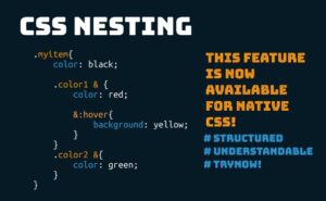
Credits: https://uipencil.com/2024/02/17/css-nesting-how-to-create-a-neat-css-file/
@scope Rule
Styling conflicts are pretty common when working on big projects. The @scope rule enables developers to scope styles to sections of the DOM, thus avoiding unintended overrides and better modularity.

Credits: https://www.youtube.com/watch?v=pQ7OLi0fdWo
CSS View Transitions API
Web applications feel much more complete when transitions are smooth. View Transitions API enables smooth transitions between different states of a page, which makes SPAs feel fluid without complicated animation libraries.

CSS Custom Media Queries
Stop rewriting media queries! The @custom-media rule allows developers to define reusable media queries, making responsive design cleaner and more maintainable.

Figure: Media Queries – Author: Seobility – License: CC BY-SA 4.0
content-visibility Property
Loading performance is important. With content-visibility: auto;, off-screen content won’t be rendered until it needs to be, so page load times are faster, which improves performance.

Credits: https://www.xenonstack.com/insights/css-content-visibility-property
Conclusion
These new changes to CSS really enable developers to create more responsive, maintainable, and better-looking sites. These features solve real-world problems in a way that’s helping drive the creation of modern user-friendly experiences. Which one of these features are you most excited about? We’d love to know how you’ll use them in your next project!
An article by Brian Thys